Here are some tips from Nicola Pollard of Pollard Design on how to create a classic interior style that is timeless and elegant…
My first piece of advice is to take your time. Settle in and get a feel for the space before you begin to furnish and decorate. Then choose furniture with simple clean lines and neutral background colours. This means that you can change the wall paint, which is relatively cheap and easy to do, without having to adjust the more expensive elements. Invest in a good-quality sofa with a solid wood frame and have it upholstered in a plain fabric that will create a timeless design. Bring in colour and pattern with small interchangeable elements like cushions and accessories.

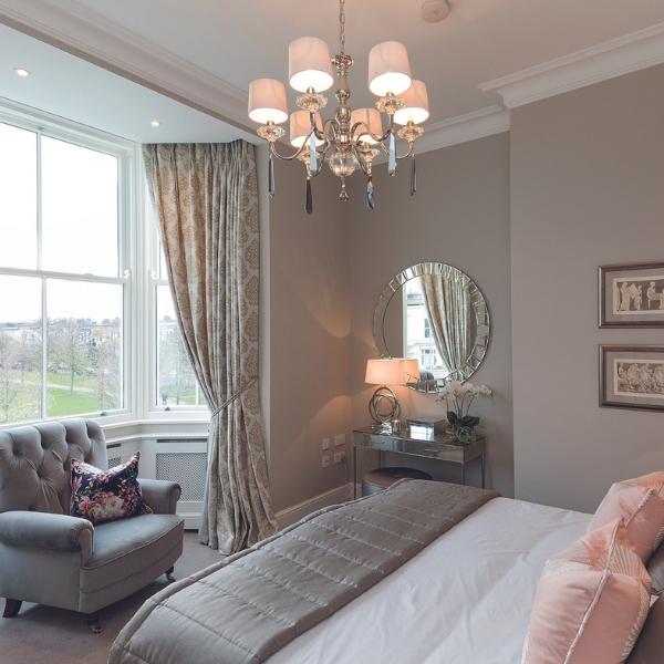
Bedroom by Pollard Design
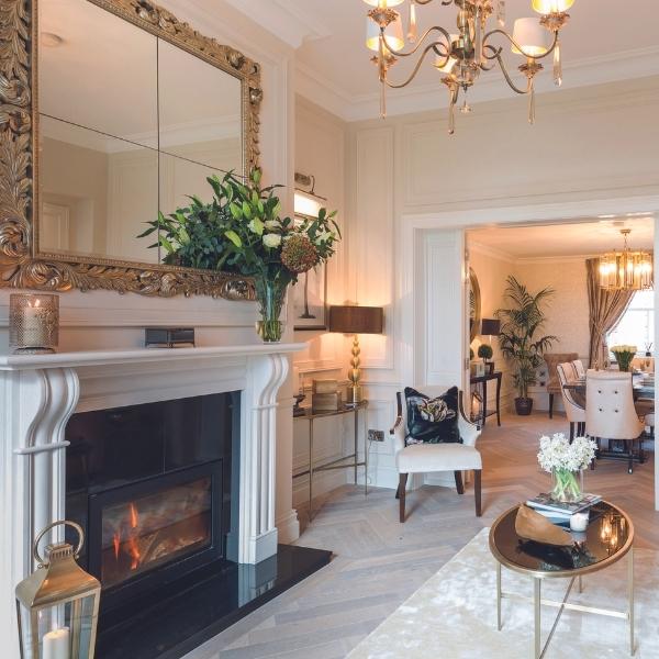
I’d also recommend investing in the drapes as these are a wonderful way of bringing elegance to a room. Again, go for a neutral colour. In a recent project in Dun Laoghaire, Co. Dublin, I went for taupe drapes in slubbed silk. They hang beautifully because they’re interlined – that’s a third layer between the silk and the lining – and I’ve used braiding on the leading edge to bring in a sense of luxury. Always be aware of the size of the rooms. Wall panelling adds interest and texture, but you need space and high ceilings. The Dun Laoghaire project was modern but built to the proportions of a Georgian house, so the panelling worked really well in the living room.

Living room by Pollard Design
Both the panelling and the skirting boards are painted in Farrow & Ball Skimming Stone because painting them in the same colour increases the sense of height. The doors and architraves are in Strong White (also Farrow & Ball) which provides a contrast, without being too much of a contrast. The floor is a semi-solid herringbone pattern in washed oak, which looks warm and contemporary. It also gives a nice sense of continuity between the rooms. The lighting is layered with recessed lighting on a dimmer switch and a contemporary chandelier with long drops under each shade that echos the tradition of a crystal chandelier. The mirror above the fireplace is a classic form but the mirror itself is modern and modular. In terms of creating this look, the biggest pitfall is that not everyone can visualise how furniture will look in a room, especially in terms of sizing and scale. So measure carefully. Furniture looks different in a showroom setting and, no matter how much you like it, may not fit the dimensions of your room. Always bring a measuring tape when you’re looking at furniture. Then, go home and map out the shape of the sofa with newspaper on the floor. If the furniture is too big it will swamp the room and nothing will look right.
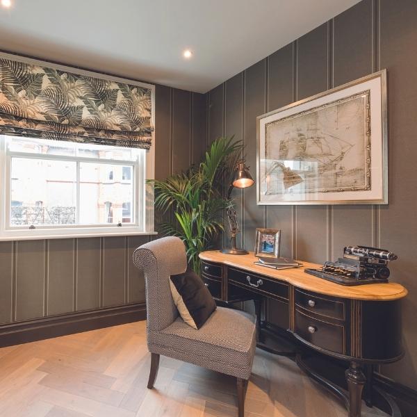
I love using dramatic wallpapers in smaller rooms. In the study, I used a striped wallpaper from Andrew Martin with dark skirting boards and a Roman blind in a botanical print from Sanderson. The desk is modern with a classic contemporary look, although an antique desk would also have suited the space if the budget had allowed it.

Study by Pollard Design
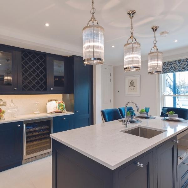
The kitchen was a challenging space as it’s situated in a long narrow basement and we went for a style that’s slightly more contemporary than the rest of the house. The units and the island are painted in a deep blue – Basalt from Little Greene – with white stone countertops. Once again, the pattern comes in with elements that can be changed like a Roman blind in fabric from Jane Churchill. The walls are in Wevet from Farrow & Ball and there are three contemporary pendants in crystal and chrome over the kitchen island.

Kitchen by Pollard Design
The hallway is a space that often gets forgotten about and that’s a missed opportunity for creating a bit of drama. In this case, we had such high ceilings that I decided to use panelling up to dado-height and a really sophisticated shade of aubergine on the walls above it. The paint is Brinjal from Farrow & Ball and it creates a wonderful sense of impact as you come in through the door. Throughout the project, we built radiator covers and these are a wonderful way of creating a timeless look. There’s nothing elegant about a radiator and they tend to date a room. The covers can be painted in any colour and they make the radiator disappear, so they’re well worth the investment. They work particularly well in a hallway where you may not have room for furniture as they provide a little shelf that can be used for decorative items.
Professional, qualified members of the Interiors Association offer everything from one-off consultations to fully bespoke design schemes for every style and budget.

