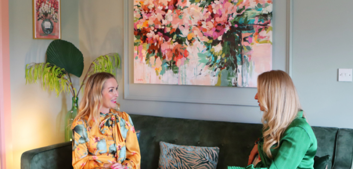
Interior designer Lana Dullaghan created a playful, elegant hallway and living room for her client, artist Caroline Duffy. Here we chat to them both about the design process & inspiration.
Artist Caroline Duffy of Caroline Duffy Designs and interior designer Lana Dullaghan of Lana Dullaghan Designs met through an interior home show last summer and immediately built up a rapport. Although painting with colour for a living, Caroline was lacking in confidence when it came to bringing her artistic side into her home and felt that it was best if she worked with a professional to help her achieve her desired look.
As Caroline comments, ‘When I booked Lana for a consultation over a zoom call, I wanted to get some tips on redesigning my hallway and sitting room. In that half hour session I got so much more than a few suggestions, she got me from the word go!’
‘Caroline approached me to redecorate her hall and adjoining living room,’ explains Lana. ‘Her hallway had to have a dual purpose, to be a welcoming area and set the tone for the rest of her home, but also a viewing gallery for clients’. However, unlike a gallery Caroline didn’t want stark white walls in her hallway, so I took all of what she wanted on board and how it could translate into the adjoining living room and fund that Caroline was really open to all of my ideas.’
‘The colour palette I came up with was one she loved, but would never have found the confidence to do on her own without professional advice. I was able to come up with the whole scheme and she could see for herself how it would all work together which for Caroline, as with other homeowners, brings comfort and in the long run saves money because you get exactly what you are after the first time around.’
The Hallway
Originally the hallway had creamy, white neutral walls but Caroline wanted this area homely and set the tone for the rest of the house. At the same time, the hallway also needed to offer a walk-in gallery in which Caroline’s clients could come and view her artwork.
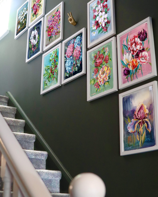
As Lana explains, ‘Looking at Caroline’s art, which focuses around flowers, I decided the best colour to use in the walls in here was Colourtrend Column Green. I used this on the walls, radiator cover, skirting boards and to paint the side of the doors leading off the hallway. Combined with white on the ceiling and stair banister as well as the richness of the existing dark wooden flooring, it creates an elegant monochromatic effect and sets the tone for the rest of the house as well as offering the perfect backdrop for Caroline’s artwork.
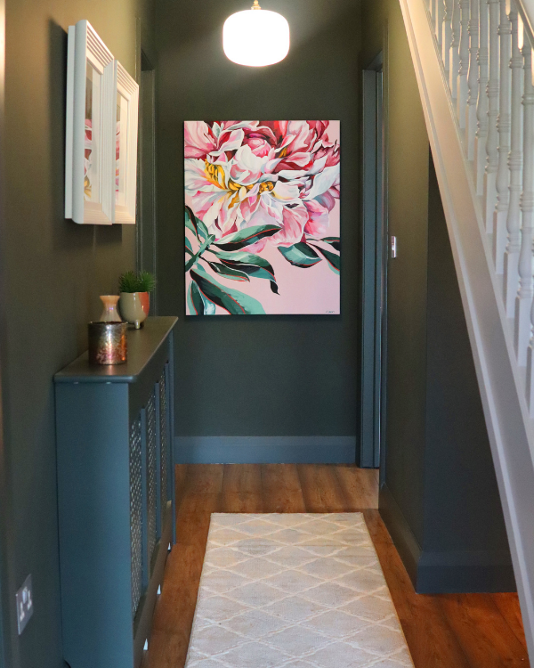
‘This isn’t a large hallway, so I painted the doors and skirting boards in the same green as the walls because it makes them disappear and in turn, the space looks much bigger and less cluttered,’ adds Lana. ‘While some people are afraid to use dark colours in small spaces, they can be dramatic and elegant and the perfect backdrop for artwork and mirrors which will make the space appear brighter.’
The Living Room
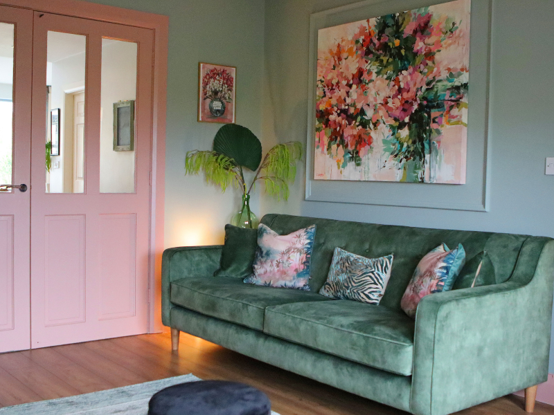
With the living room leading off from the hallway, Lana wanted it to feel connected and continued the green theme in here too.
‘I wanted to bring some fun to this space and opted for a few different shades of green, paired with pink. Again both of these colours are prominent in Caroline’s floral artwork and her pieces sit perfectly on the walls in this space.’
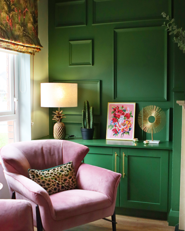
For the walls Lana has used a springlike green, Sliver Mist by Fleetwood Paints and has opted for a bold contrast on the feature wall and units, which are painted in Jungle Adventure by Colourtrend. The skirting boards and door panels in this room are finished in Betsy 1920 Light from the Vogue Collection by Fleetwood Paints, which is an off-white paint with pink undertones.
As well as working with the existing flooring in this room, Lana also had to take the fireplace into consideration. Certainly, it ties in perfectly with the elegant theme running across both spaces and Lana added touches of creamy white and golden metallics throughout the space to tie it in.
All has been carefully considered, right down to the Roman blind which echoes the colours in the hallway and as well as those used in this room and is another example of the elegant, yet playful design of this whole project.
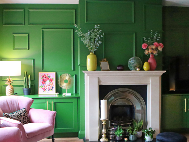
This space is a universal room for the entire family. Caroline adds: ‘For 11 years my front sitting room has been a playroom, art room, music room to my children Finn (11), Rhea (9) and Oscar (8) – and now also a home gym during lockdown! I had lots of ideas about what I wanted it to feel like; comforting, calm and stylish. I wanted it to be a space where Fra and myself could practice my morning meditations, read or write in my journal, a room for watching family movies, a space for relaxing with friends. Lana pulled all my ideas together and added to them tenfold.’
‘The colours, furniture and soft furnishings she chose echoed the colours and feelings from my art.This room has a beautiful energy and we love spending our time in this space!’
Lana’s Top Tip
When it comes to adding colour to your home, face your fear and step out of your comfort zone. There are lots of fabulous interior designers who would be happy to consult with you and give you their professional advice on the colours to use in your home.


